Kiosk website study

Two warmer accents.

The layout, photography and typography are identical. Only the neon green accent has changed, so the comparison is focused on tone.

Return to current site
Option A — Warm orange#E86D34 · Burnt tangerine
Toronto · Since 1994

Exceptional interiors begin here.

Contemporary European furniture, lighting, kitchens and architectural systems—selected with expertise and delivered with care.

Explore KioskBook a consultation
288 King Street East · 20,000 sq. ft.
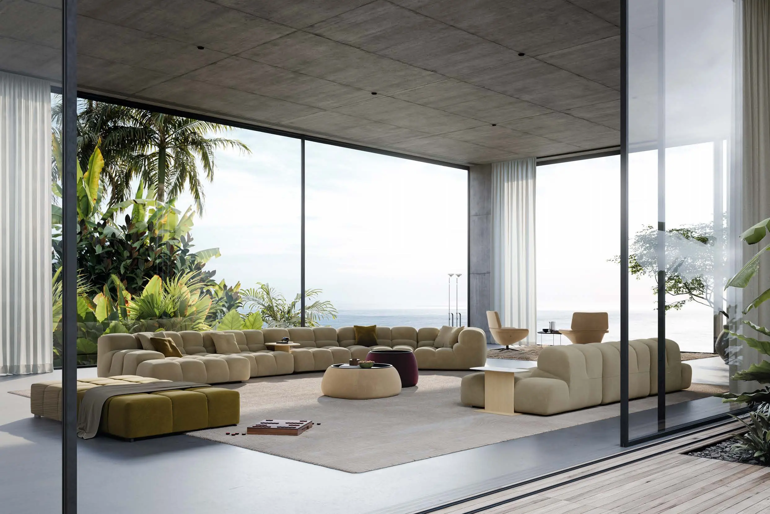
B&B Italia Tufty-Time 20B&B Italia · Tufty-Time 20
For architects + designers

Trade at Kiosk.

Dedicated sourcing, samples and project support for architects and designers.

Register with Kiosk
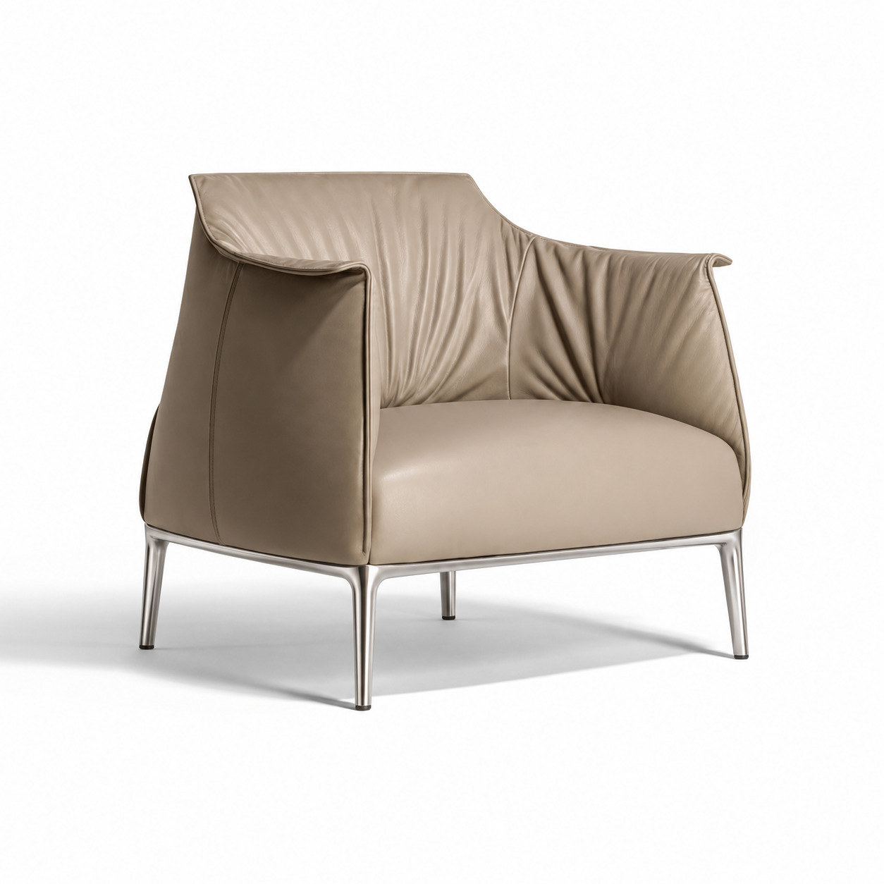
Archibald armchairSaved 3
Poltrona Frau

Archibald

Warm orange feels energetic, contemporary and slightly more playful.

Character

More distinctive and optimistic. The orange works especially well with walnut, leather, terracotta and the warmer tones found throughout European furniture photography.

Option B — Warm red#C94B43 · Brick red
Toronto · Since 1994

Exceptional interiors begin here.

Contemporary European furniture, lighting, kitchens and architectural systems—selected with expertise and delivered with care.

Explore KioskBook a consultation
288 King Street East · 20,000 sq. ft.
B&B Italia Tufty-Time 20B&B Italia · Tufty-Time 20
For architects + designers

Trade at Kiosk.

Dedicated sourcing, samples and project support for architects and designers.

Register with Kiosk
Archibald armchairSaved 3
Poltrona Frau

Archibald

Warm red feels grounded, confident and more closely tied to Italian design heritage.

Character

More mature and architectural. The brick red has greater weight and sophistication, but it creates a stronger visual statement whenever it fills a large section.